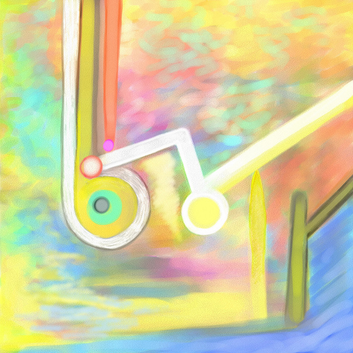
“Topsyturvy 1”
DESCRIPTION FOR THE COMPLETE SERIES 1-6 „Topsyturvy(1)“
like Topsyturvy(2) u. (3)
were created in July 1999, Topsyturvy(4) in October 1999, Topsyturvy(5)
in November
1999 and Topsyturvy(6) followed in December 1999, all of them with PC und
„Painter“
(Metacreations). The complete series, print 1-6: 1800.-€
Print: Digital Fine Art on Somerset Velvet Size: Paper: 36x36 cm, Picture: 30x30 cm Copies: 95, numbered and signed, and 5 artist's copies (I-V) Price: 400.‒ Euros Artist: Björn Dämpfling
The
series „Topsyturvy“ got its title from the first image, for which it is
pretty self explanatory. This image and image No.2 of the series are
in
addition good examples in order to show that digital equivalents of well
known media, like watercolors in this case, have their very own
aesthetic character and are by no means capable of replacing their
physical counterparts. It is not only the lack of physical qualities,
but
rather the fact that even a photographed or scanned stroke of a pen or a
paintbrush, lacking the “physical” qualities of the original too,
still
looks very different from the digitally simulated output. This difference
can be bigger or smaller depending on the simulated “natural
Topsyturvy media” chosen, like the series demonstrates quite well.
Using “digital” chalk like for No.4 and 5 the difference isn’t as
dominant, as with using
digital watercolors, but disregarding it would be naïve. For my own work the
quality of simulating natural media in terms of similarity
never played any role, because I have drawn with everything that makes a
line and on everything that can hold the color. And my most beloved
drawing tool in the world of physical media is a ballpoint in my
pocket, having the color it has. For an artist this is only slightly
less
exotic than dealing with digital watercolor. That one might find “heads”
and “fish” quite often in my drawings is true. But this series of six
images in a row, same format, same size, should exemplify the driving
force behind my way of image creation, which is to surprise myself
with new images all the time, not to develop a “style”. It is my aim
to produce genuinely new images, recognizable as mine, as
“Dämpfling”, so to speak, but not by a personal formula, neither for
the themes nor the style. Individuality, being identifiable can be
accomplished
as well by those many small repeating traces that have an imprint on
every image one does. This is true even if the history of art is no
relevant source for ones own creations. Repetitions occur and they
are essential for recognition, but the question is how they
occur. Repetitions should never dominate or define, just add what is
necessary to recognize an image as mine, once someone has seen one
of my images with a comparable visual content. Otherwise the real or
virtual trashcan is the final destination. The series “Topsyturvy”
should be able to demonstrate what can only be seen, giving visual
proof.

